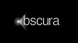
#libobscura text #logo - I made another logo for when it's necessary to have a prominent name.
Which one do you like more? The one with blur or without?
Poll in comment.
#design #OpenSource
Which one do you like more? The one with blur or without?
Poll in comment.
#design #OpenSource


dorotaC •
Doug Webb •
Did you try the "o" with the font instead of an actual circle? If you stick with circle, perhaps same height as other letters?
In any case do you know about https://opensourcedesign.net/#page-top
Open Source Design
Open Source DesigndorotaC •
Doug Webb •
My pixel sense was tingling...
dorotaC •