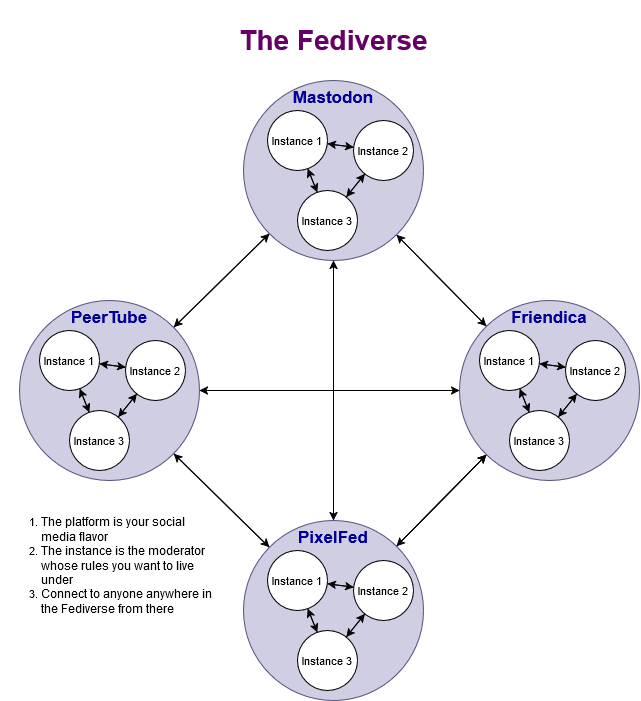
I made a simple diagram to help show people who aren't on the #Fediverse how it works. Feel free to share with people who want to escape #Musk and #Zuckerberg but feel intimidated by the Fediverse.
#socialmedia #Twitter #X #Meta #Facebook #Threads #Instagram #Mastodon #PixelFed #Friendica #PeerTube #fascism
#socialmedia #Twitter #X #Meta #Facebook #Threads #Instagram #Mastodon #PixelFed #Friendica #PeerTube #fascism


crossgolf_rebel - kostenlose Kwalitätsposts •
There are no borders between the individual services, so the drawing is not suitable. In reality, all instances of all software projects in the Fediverse are wildly mixed.
The sorting suggests that each project is separate, but this is not the case.
The following logo shows the distribution much better
Sven222 •
But the idea is for sure right, there are no borders between the different software services. That is how the fediverse logo developed.
crossgolf_rebel - kostenlose Kwalitätsposts •
@joshisanonymous@h4.io
Joshua McNeill •
crossgolf_rebel - kostenlose Kwalitätsposts •
A simple but false explanation only makes it worse, not better.
The fediverse is just a bag of colourful marbles.
You are welcome to use our instance cloud to show the limits of the individual softwares
https://tube.tchncs.de/w/xd4emjFTvQSp8ixPP7AJCP
#Fediverse Instanz Wolke über einen Tag - 02. April 2024
tchncsJoshua McNeill •
Look, having just over a million active users is a tiny drop in the bucket, and it's been widely acknowledged that the onboarding process for Fediverse platforms is not the most user-friendly thing, so a simple explanation is very much needed.
Furthermore, this is literally how all teaching works: you oversimplify at first before adding bits and pieces that complicate the picture. I'm not sure why you think that's harmful.
crossgolf_rebel - kostenlose Kwalitätsposts •
It is simple but wrong
And, a simple description for a complex structure can only ever be wrong, however good the intention behind it may be.
The instances and the software installed on them are sorted exactly as shown in the picture. There is no sorting.
This is because it is quite common for three or more different pieces of software to be involved in a single conversation.
Joshua McNeill •
crossgolf_rebel - kostenlose Kwalitätsposts •
Unfortunately, there are enough Mastodon admirers who consider this software to be the crown of creation and want to remove everything that is not Mastodon. They use such simple representations to support their theses.
Ultimately, your simplification is not correct either, because even mastodon has three different types of software
If you want to make it simpler, then represent instances as circles with a nice colourful mix for the different software and connect them. Without the ballast of representing the types as separate networks
That would be simplified and quite correct
Sven222 •
Joshua McNeill •
Sven222 •
Joshua McNeill •
Sven222 •
crossgolf_rebel - kostenlose Kwalitätsposts •
And as for the insult, my English isn't good enough to understand that.
Again, your diagram is technically wrong and also symbolically wrong.
The picture of the coloured balls still fits best.
Draw 5 connections from each ball to any of the balls in the picture.
That is the Fediverse.
You can simplify such a pattern so that it fits halfway.
Each connection of a single instance in the Fediverse is unique, a chaos of connections. On this basis, every ordered image is always wrong.