Suche
Beiträge, die mit incarceration getaggt sind
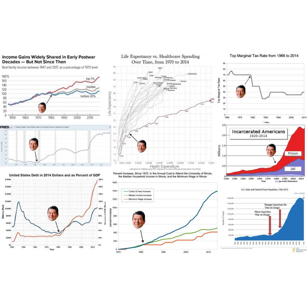
Ronald Reagan’s real legacy, charted and graphed. Spoiler: It’s not the bedtime story we’ve been told.
A visual breakdown of the inequality, debt, and mass incarceration still shaping our lives.
'Trickle-down' economics was never real.
#economics #economy #AmericanPolitics #USpol #politics #political #RonaldReagan #reagan #reaganomics #TrickleDownEconomics #TrickleDownTheory #TrickleDown #WealthGap #WealthInequality #healthcare #health #taxes #debt #CostOfLiving #education #incarceration

