Suche
Beiträge, die mit RonaldReagan getaggt sind
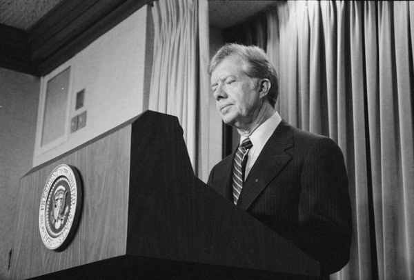
#RIPJimmyCarter -- #Humanitarian #ClimateChangePioneer #NiceGuy. My late grandmother volunteered to get him elected and worked on his re-election campaign, and said he was the only decent human being to run for the office. We both thought he had been set up by the #GOP -- and it turns out, we may have been right!
New claim about #IranHostageCrisis sabotage may change narrative of #Carter presidency
Mar 20, 2023
"In the summer of 1980, a prominent Republican close to #RonaldReagan's campaign sought to sabotage then-President Jimmy Carter's reelection by asking #MiddleEastern leaders to get a message to the #Iranians: Keep the American #hostages until after the election, and the Reagan administration will give you a better deal.
"That stunning reporting this weekend by The New York Times is prompting a rethinking of presidential history."
https://www.pbs.org/newshour/show/new-claim-about-iran-hostage-crisis-sabotage-may-change-narrative-of-carter-presidency
#USPol #RestInPowerJimmyCarter

New claim about Iran hostage crisis sabotage may change narrative of Carter presidency
In 1980, a prominent Republican sought to sabotage then-President Jimmy Carter's re-election by asking Middle Eastern leaders to get a message to the Iranians; keep the American hostages until after the election and Reagan will give you a better deal…Geoff Bennett (PBS News)
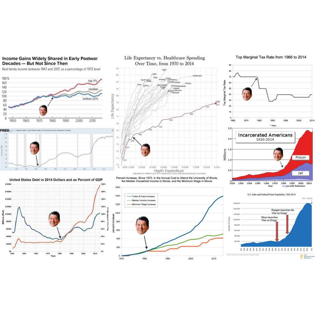
Ronald Reagan’s real legacy, charted and graphed. Spoiler: It’s not the bedtime story we’ve been told.
A visual breakdown of the inequality, debt, and mass incarceration still shaping our lives.
'Trickle-down' economics was never real.
#economics #economy #AmericanPolitics #USpol #politics #political #RonaldReagan #reagan #reaganomics #TrickleDownEconomics #TrickleDownTheory #TrickleDown #WealthGap #WealthInequality #healthcare #health #taxes #debt #CostOfLiving #education #incarceration

