Suche
Beiträge, die mit DataViz getaggt sind
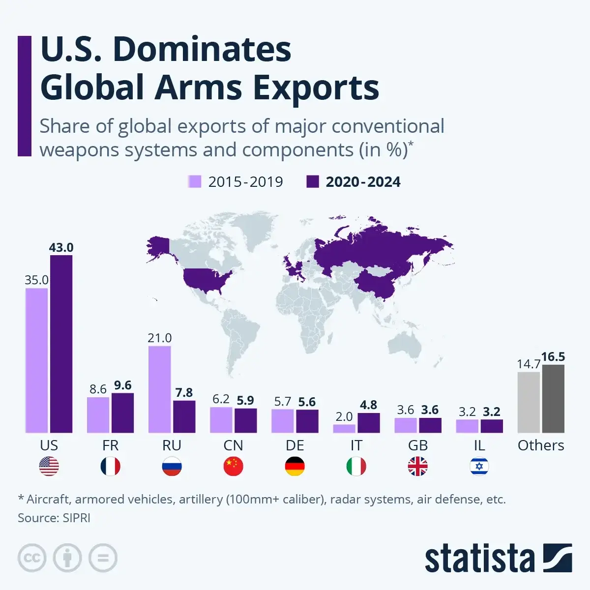
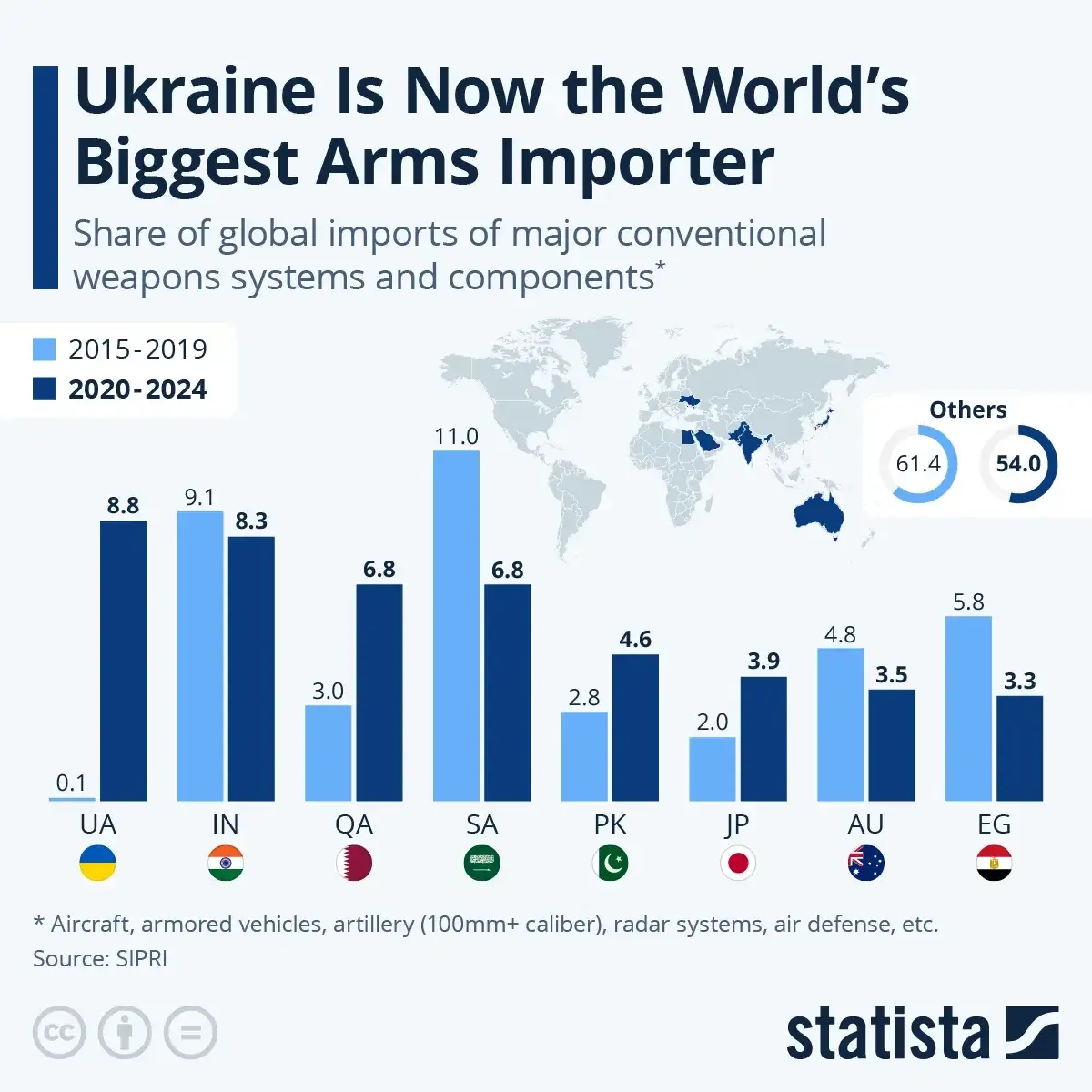
#US #UnitedStates #America #FR #France #RU #Russia #CN #China #DE #Germany #IT #Italy #GB #GreatBritain #UK #UnitedKingdom #Britain #IL #Israel #UA #Ukraine #IN #India #QA #Qatar #SA #SaudiArabia #PK #Pakistan #JP #Japan #AU #Australia #EG #Egypt #international #production #industry #trade #war #military #arms #world #exports #imports #graphic #data #visualization #DataViz

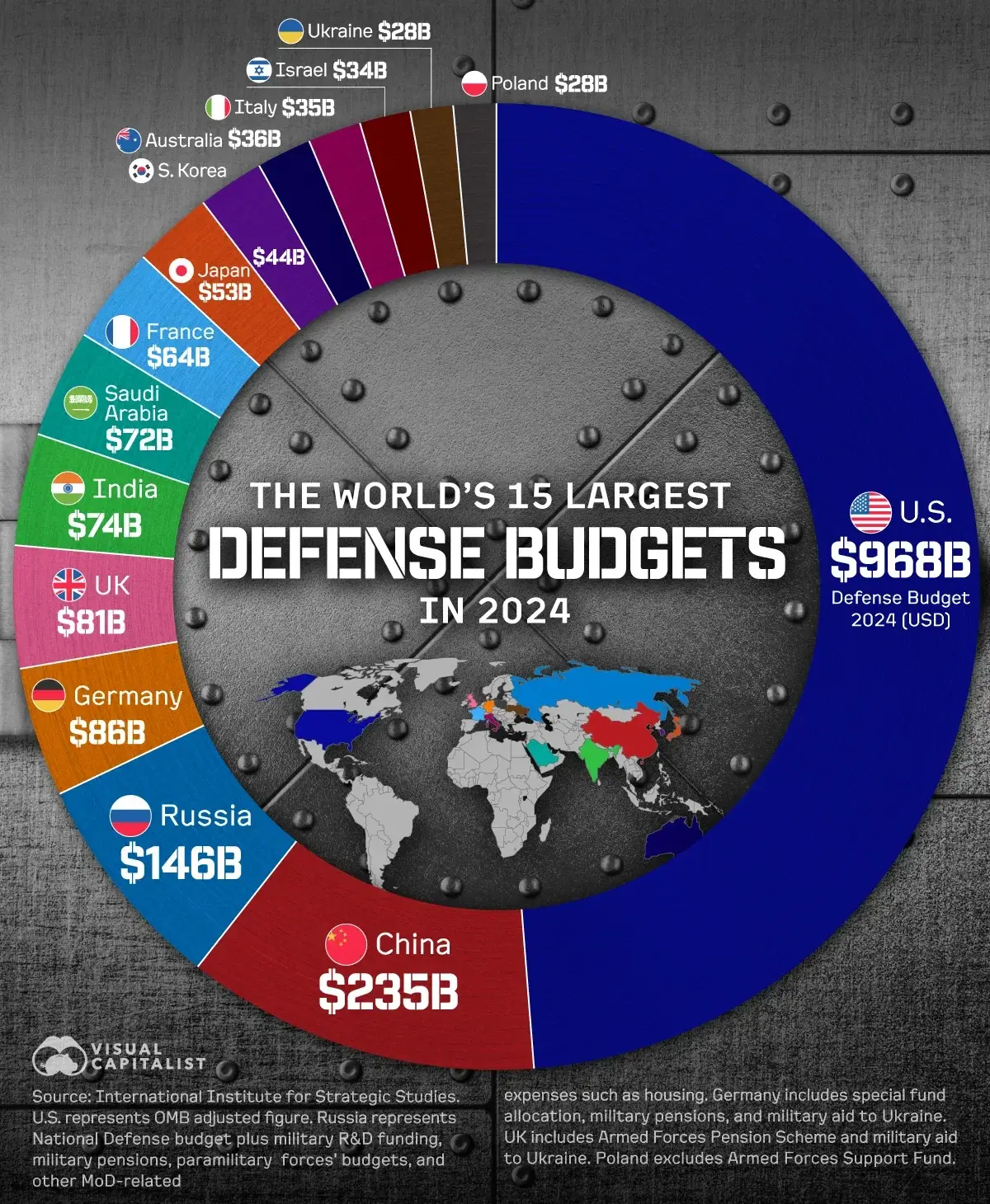
#US #UnitedStates #China #Russia #Germany #UK #UnitedKingdom #India #SaudiArabia #France #Japan #SouthKorea #Australia #Italy #Israel #Ukraine #Poland #Pentagon #NATO #military #war #nuclear #visualization #DataViz
Join the #DataViz for #LifeScience course at EMBL-EBI!
Organised by Jan Aerts/Ryo Sakai, this year with yours truly for a keynote! :)
--> Application due March 9th
https://www.ebi.ac.uk/training/events/data-visualisation-biology-2025/

https://flowingdata.com/projects/dishonest-charts/

Defense Against Dishonest Charts
This is a guide to protect ourselves and to preserve what is good about turning data into visual things.FlowingData
Link below! 👇
#Coding #DataJournalism #DataViz #TypeScript
@labplot@lemmy.kde.social
Boosts appreciated! 🙂

With the latest merge requests, we have added new options to #LabPlot that:
🚀 Allow to specify in the application settings both separators,
🚀 Automatically update the visualizations on number format changes without restart.
#FreeSoftware #OpenSource #FOSS #FLOSS #DataAnalysis #Math #Statistics #OpenScience #DataViz #Research #Data #Science #Engineering #STEM #KDE #UX
👉 https://www.spsanderson.com/steveondata/posts/2024-12-17/
#R #RStats #Programming #DataViz #Code #Blog
 and mean() functions. The window has the classic macOS-style red, yellow, and green buttons at the top. The code is syntax-highlighted with comments in grey-green, functions in light blue, and values in red, making it easily readable against the dark background.\"")
A Complete Guide to Using na.rm in R: Vector and Data Frame Examples – Steve’s Data Tips and Tricks
Master handling missing values in R with na.rm. Learn practical examples for vectors and data frames, plus best practices for effective data analysis.Steve's Data Tips and Tricks

Here are over 27 examples of d...
ActivityPub top 6:
🥇 #Germany: 1000+
🥈 #USA: 225+
🥉 #France: 120+
🎖️ #UK: 110+
🎖️ #Netherlands: 80+
🎖️ #Switzerland: 40+
Query bubble chart:
https://w.wiki/CGYX
Query dataset:
https://w.wiki/CGYe
We lack data! Edit Wikidata! 🌈

https://taz.de/Website-The-Pudding/!6049633/ (German)
… but slightly misses the mark when reducing the "wild mix of topics" to pop culture. i mean:
- work: https://pudding.cool/2024/11/sitters-standers/
- abortion: https://pudding.cool/2024/10/abortion-mazes/
- sleep training: https://pudding.cool/2024/07/sleep-training/
- child abuse: https://ydcpodcast.org
- climate impacts: https://pudding.cool/2024/06/climate-zones/
#datavis #dataviz #storytelling #scrollytelling #datajournalism

Website „The Pudding“: Wenn Liebe gezählt wird
„The Pudding“ zeigt, wie man Popkultur in Datenvisualisierungen denken kann. Klingt trocken, ist aber spannend umgesetzt.Ann-Kathrin Leclere (taz)
#rail #dataviz #passenger


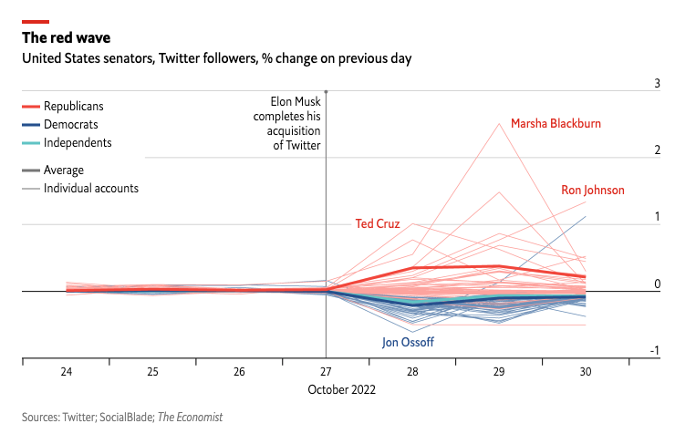
#Twitter #TwitterMigration #ElonMusk #TheEconomist #data #dataviz
https://www.economist.com/graphic-detail/2022/10/31/how-will-elon-musk-shape-twitter