Suche
Beiträge, die mit Design getaggt sind
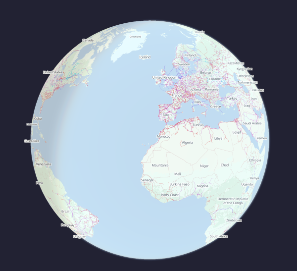
More info & how to apply: https://github.com/openinframap/openinframap/discussions/216
#OpenStreetMap #design #webdesign
Wanted: designer (paid contract) · openinframap openinframap · Discussion #216
Open Infrastructure Map is an open-source map of the world's infrastructure using data from OpenStreetMap. We're looking for a graphic designer to help improve the design of the website. We need: A...GitHub
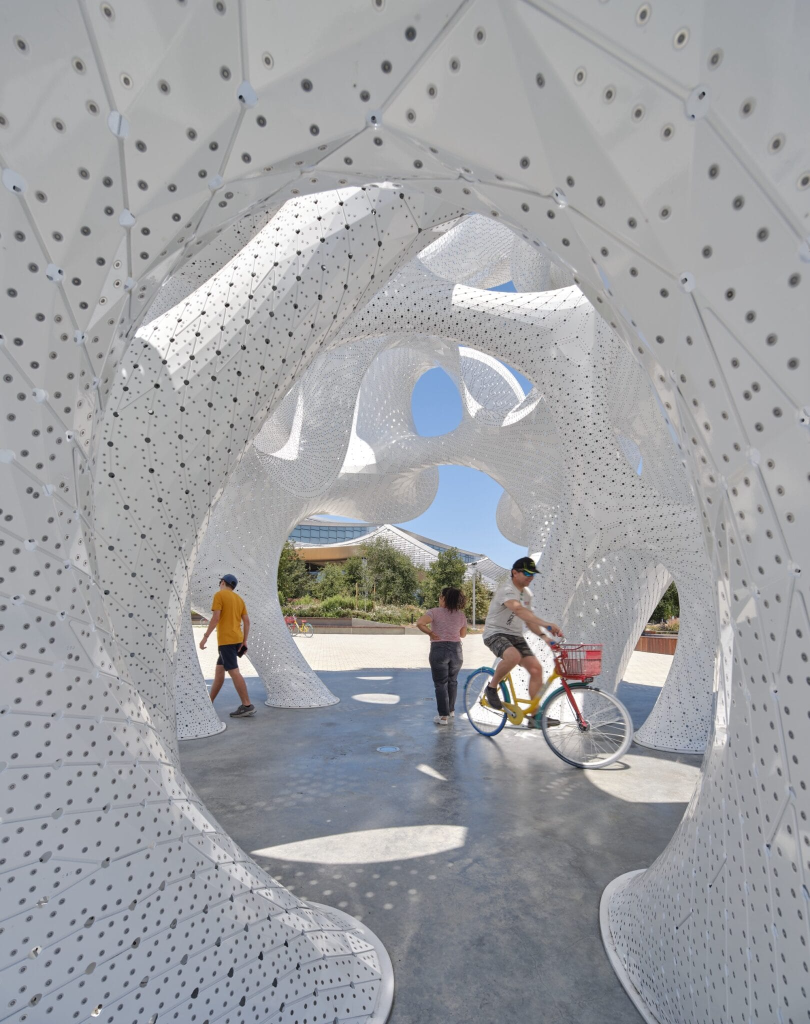
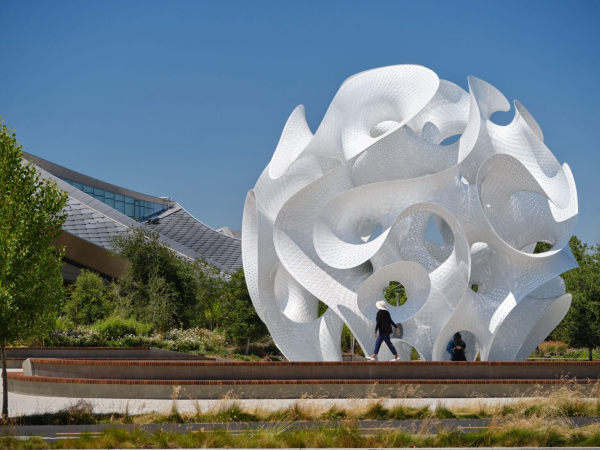
https://www.thisiscolossal.com/2025/04/marc-fornes-theverymany-the-orb/
#design #installation #architecture #publicart #metal
200,000 Rivets Secure the Ultra-Thin Aluminum Facets of 'The Orb' by Marc Fornes — Colossal
Marc Fornes / THEVERYMANY’s newest public work invites visitors to immerse themselves in a luminous installation.Kate Mothes (Colossal)

iOS 19: Video zeigt neues Design - Glasseffekte und schwebende Menüs
Ein neues Video des Tech-YouTubers Jon Prosser gibt detaillierte Einblicke in das überarbeitete Design von iOS 19.Felix Krauth (WinFuture.de)
This one's been cooking for a while, and I hope you find it interesting. 📚💙
https://keeganleech.co.za/blog/book-cover-bias
#blog #books #reading #design #gender
Gendered bias in modern covers of classic books
Exploring some subtle but prevalent gendered biases to the colours used on the covers of classic books.keeganleech.co.za
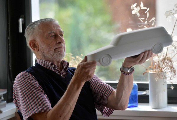
Visionär und Designlegende: Auf den Spuren von Clauss Dietel
Von Erika-Schreibmaschinen bis zum Moped S50: Karl Clauss Dietel hat vielen Alltagsgegenständen eine besondere Form gegeben. Seine Spuren sind auch im Chemnitzer Stadtbild zu entdecken.DieSachsen News (DieSachsen.de - News aus Sachsen)
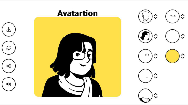
Mit Minimox und Avatartion bastelt man mithilfe einfacher Designs minimalistische Logos und Avatare und kann diese anschließend kostenlos herunterladen.
https://www.heise.de/news/Web-Tipps-Schnell-was-basteln-10321574.html?wt_mc=sm.red.ho.mastodon.mastodon.md_beitraege.md_beitraege&utm_source=mastodon
#Bildbearbeitung #Design #Entertainment #GitHub #ctWebtipps #news
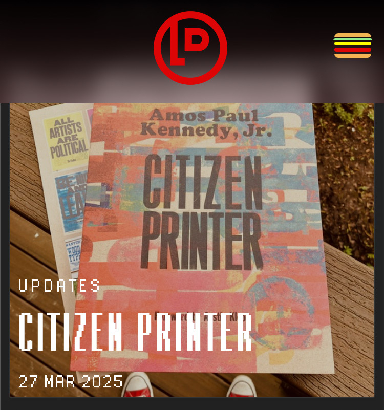
Bold Ink Agitation
The Amos Paul Kennedy, Jr. book of activist printing has expanded my mind, published by @letterformarchive
#blog #book #letterpress #design #art #activism #poster
https://lukedorny.com/updates/citizen-printer
#blog #design #printing #letterpress #apkjr
#letterformarchive #bima #art #museum
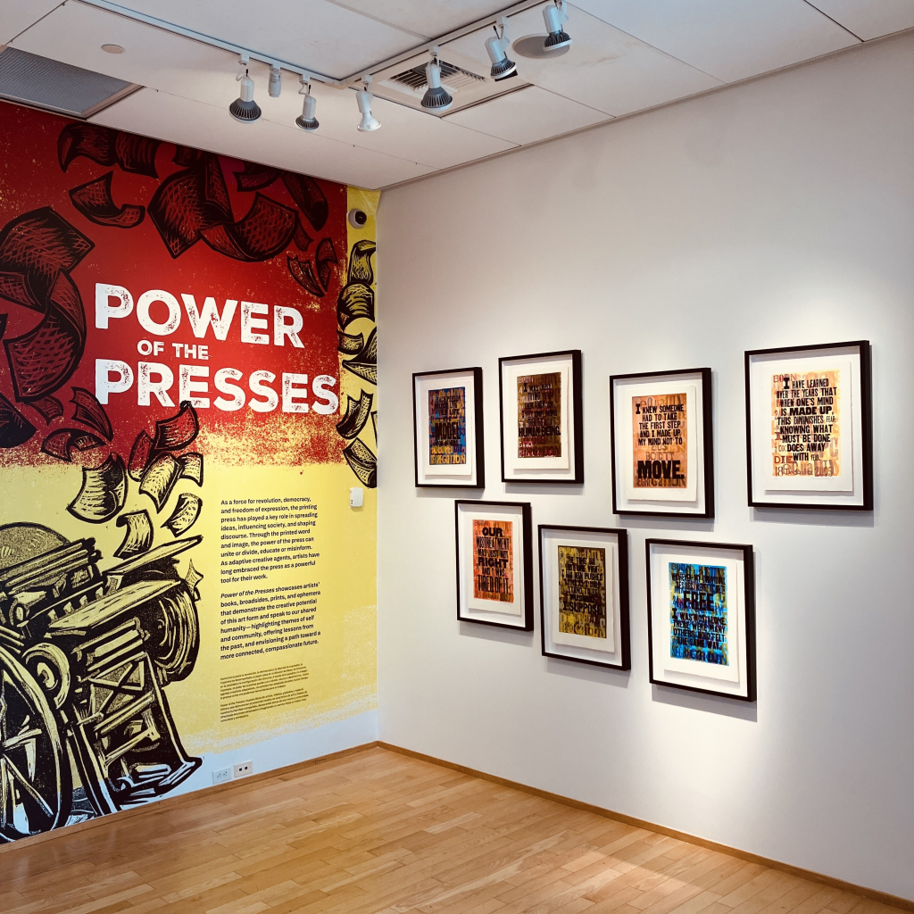
https://lukedorny.com/updates/power-of-the-presses
🎨 I am primarily a UX/UI designer
🤖 I also do front end development
🏃♂️ I’d love to animate some stuff
🚀 Boosts appreciated
https://stublag.com/hello
#getfedihired #design
Mit diesem Wettbewerb möchten wir Frauen zur Teilnahme an der Freien Community ermutigen. Dazu könnt ihr eine Webseite gestalten.
#Programmierwettbewerb #Wettbewerb #Frauen #Design #Webseite #Linux
https://gnulinux.ch/wettbewerb-frauenbeteiligung
1967 — Corita Kent
Still a problem today.
#blog #design #activism #protest #art #artist
https://www.juxtapoz.com/news/magazine/stop-the-bombing-corita-kent-and-a-timeless-message/

Juxtapoz Magazine - Stop The Bombing: Corita Kent and a Timeless Message
Produced during the height of the Vietnam War, Corita Kent’s stop the bombing (1967) captures the nation’s growing anti-war sentiments. Featuring a po...www.juxtapoz.com
Went to a tapas place last night, great food, even better dessert. The planter is some mint leaves stuck in homemade chocolate crumble. Dig down, it's incredible chocolate mousse.
All this is to say, the dessert reminds me of old school iOS and skeuomorphism, with all its felt, fine wood and torn paper.
I'd love to see that come back.
Apple #Design
Fizz Buzz has just enough complexity to demonstrate a principle that is usually tough to understand through toy examples: the open/closed principle.
https://kerrick.blog/tutorials/2025/fizz-buzz-object-oriented-edition/
#blog #programming #WebDev #SoftwareEngineering #Software #Design #OOP #OpenClosedPrinciple #Metaprogramming #Ruby
Fizz Buzz, Object-Oriented Edition: Exploring the Open/Closed Principle With Polymorphism and Metaprogramming - Kerrick Long's Blog
Learn to use refactoring, object-oriented design, and metaprogramming to trade simplicity for extensibility using Fizz Buzz as a base.Kerrick Long (Kerrick Long's Blog)
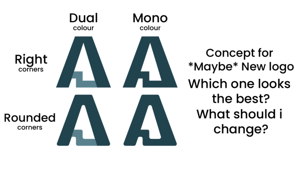
Concept art Time! Maybe I will release new Andrecon Logo, who knows?
I come up with this design on de toilet lol
These are the concepts! Dual Colour, Mono Colour Rounded and Straight Corners. Imma work on the colours later, but first i wanna know which one is the best
#andrecondes #concept #logo #design #pleasechoosegoodstuff
#Thunderbird #OpenSource #Design
https://blog.thunderbird.net/2025/03/video-the-thunderbird-design-system/

VIDEO: The Thunderbird Design System
The Office Hours Team chat with Design Manager Laurel Terlesky about moving from 28 shades of blue to the new Thunderbird Design System.Monica Ayhens-Madon (The Thunderbird Blog)
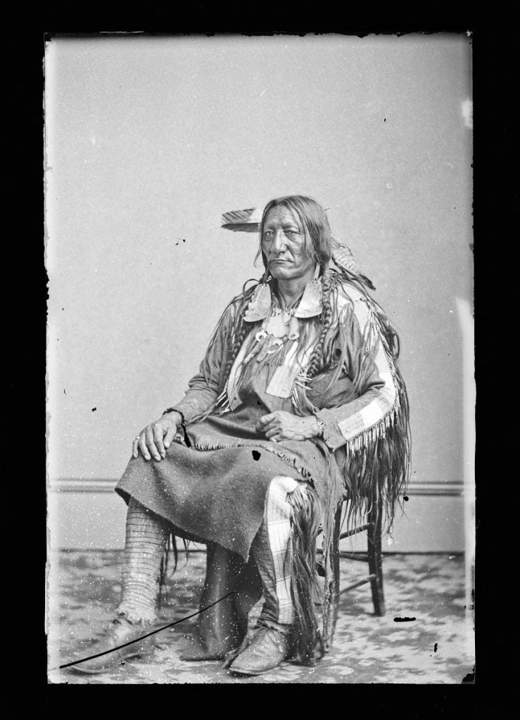
artist: Mathew Brady Studio, active 1844 - 1894
source: National Portrait Gallery
notes: The Frederick Hill Meserve Collection comprises more than five thousand […]
#Art #Design #Museum #Gallery #MastodonArt #MastoArt #Culture #Random
https://npg.si.edu/object/npg_NPG.81.M2291

Pixel 10: Erste Bilder - So soll das neue Google-Smartphone aussehen
Das Google Pixel 10 wirft seine Schatten voraus. Denn jetzt geben erste Renderbilder Einblicke in das Design des kommenden Flaggschiffs.Felix Krauth (WinFuture.de)
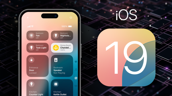
Apple plant neues Design für iOS & macOS: 'größtes Update seit Langem'
Der US-Computerkonzern Apple soll am größten Update für die Design-Sprache seiner Betriebssysteme seit Langem arbeiten. Mit iOS 19 und macOS 16 soll laut gut informierten Quellen eine komplette Überarbeitung geplant sein.Roland Quandt (WinFuture.de)
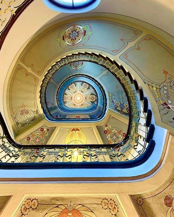
the ART NOUVEAU report building at 12 Alberta iela, in the center of Riga (Latvia), designed by local architects:
Konstantīns Pekßēns and Eižeus Laube and built in 1903.
Currently houses the ART NOUVEAU Center in RIGA
By #StainedGlassArtCreations
#Architecture #Design #Style #Nature #Art #Artist #Photo #Photographer #Urbanism #City #Village #Staircases #History #Histoire #Abandoned #AbandonedPlaces
Recent projects inc Illustrations for Huntington's Disease therapy, conference materials, and charity streaming assets.
You can find some of my recent work at https://andycarolan.com
Get in touch here or via the about page on my site!
#FediHire #design

Andy Carolan
Andy Carolan is an illustrator and designer living in the UK. His work is playful and fun with a bold and bright style.Andy Carolan Illustration and Design
#art #design #BigArtThread
Then I saw this piece from @gruber lusting after the new Sigma BF camera:
https://daringfireball.net/linked/2025/02/24/sigma-bf
SO reminds me of something Jony would have built. And do watch this Sigma BF detail video. That voiceover so reminds me of Sir Jony.
https://www.youtube.com/watch?v=N3aWpngPnFI
Apple #Design #Photography

Sir Jony Ive verrät, dass sein iMac-Design nur drei Wochen dauerte
Sir Jony Ive ist in der BBC-Radio-Show "Desert Island Discs" aufgetreten, in der ein Prominenter über sein Leben und die Musik, die ihm am wichtigsten ist, berichtet. Dabei wurde auch viel über Apple gesprochen.Nadine Juliana Dressler (WinFuture.de)
A Fresh Website · Cutting-edge ideas for your next web project https://ilo.im/161v6l
_____
#Inspirations #Gallery #Website #Blog #LandingPage #Creativity #ProductDesign #UxDesign #UiDesign #WebDesign
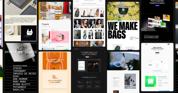
a-fresh.website | Web design inspiration
Discover endless web design inspiration with our curated gallery of award-winning websites and creative ideas. Explore stunning examples of innovative design to spark creativity and elevate your next digital project.ilo.im
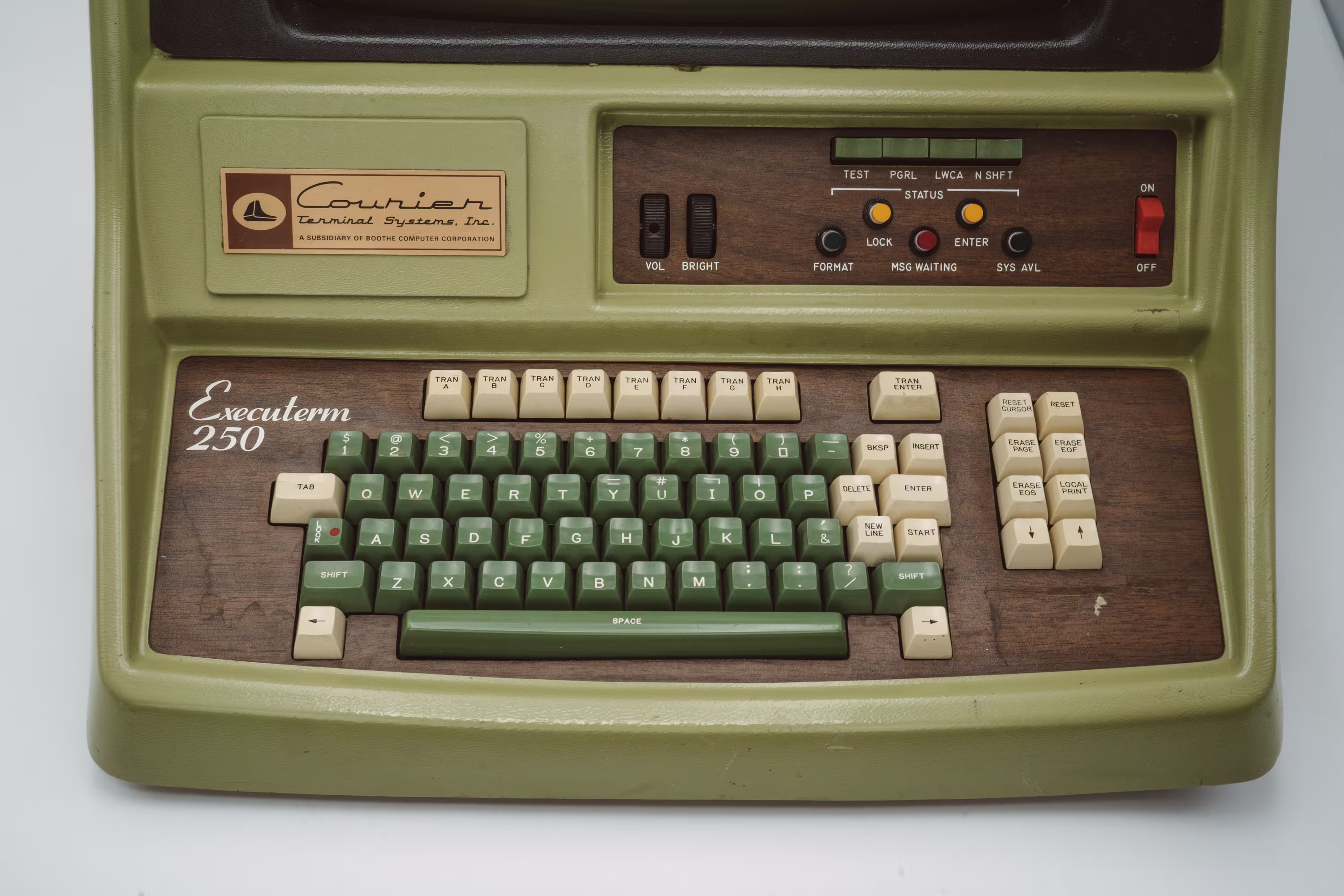
#photo #USA #US #american #typography #font #design #history
The hardest working font in Manhattan
A story of a 150-year-old font you have never heard of – and one you probably saw earlier today.aresluna.org
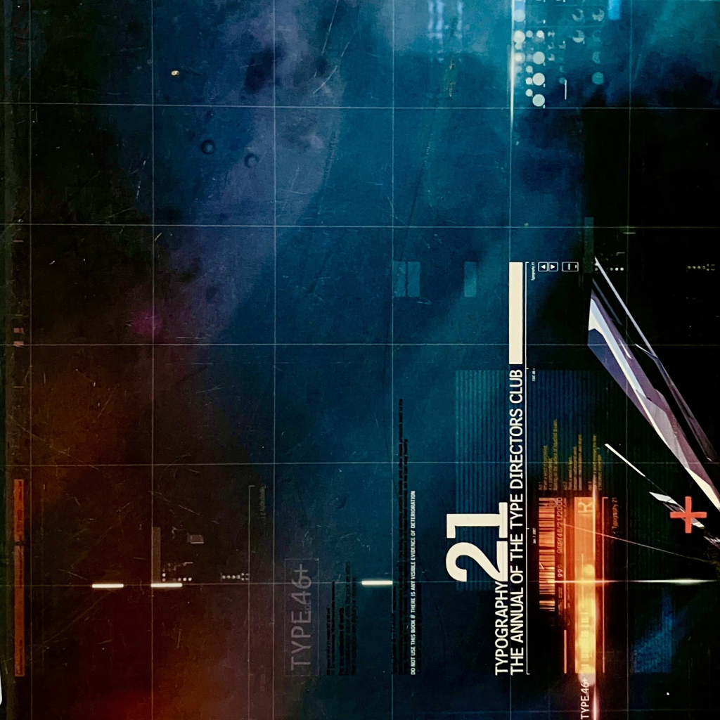
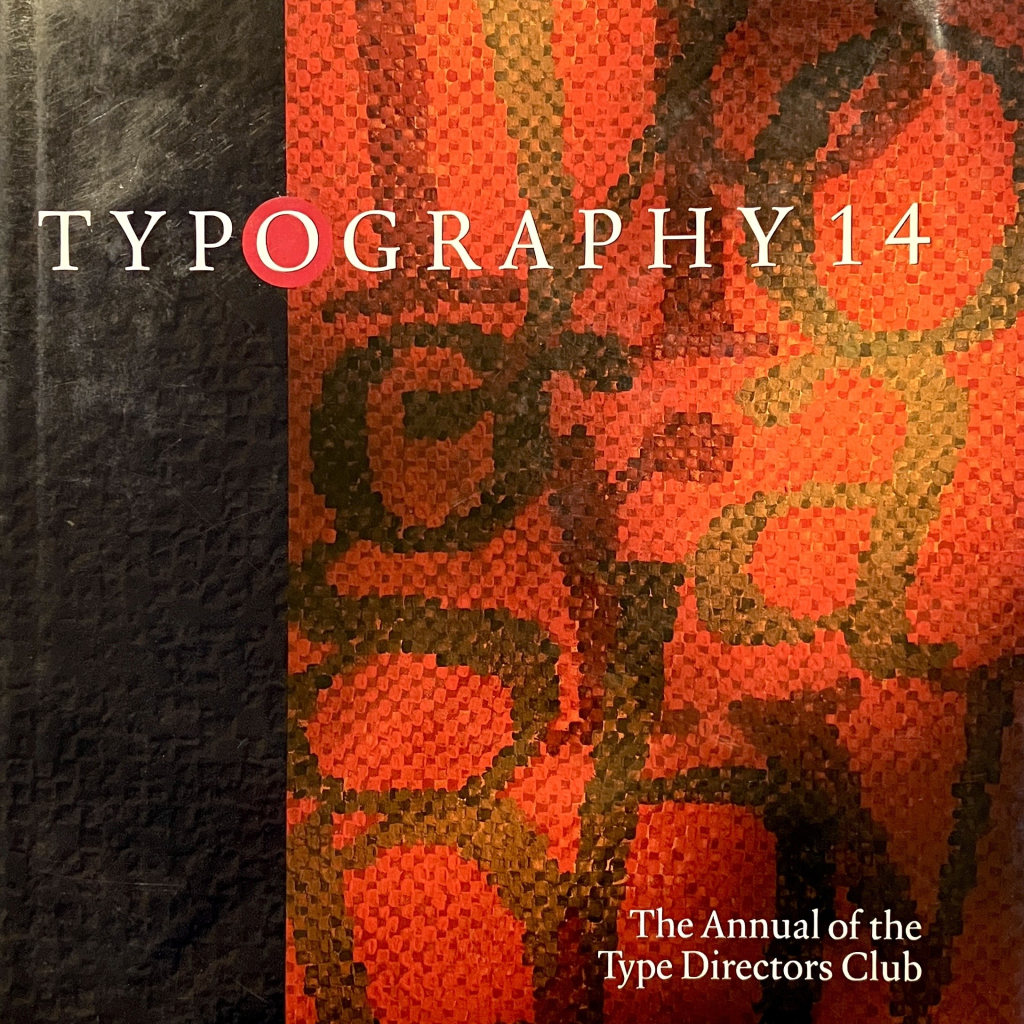
https://shoptdc.org
#blog #type #typography #design #tdc #typeDirectorsClub
Type Directors Club Shop
Offering publications and products that promote excellence in typography and celebrate accomplishments of our international membershipType Directors Club
https://samerion.com/journal/2025-01
Last year, Samerion has finally seen the long awaited changes to its design. Today, I discuss its history, elaborating on past designs, and explain elements that make up the current day look of the website.
#samerion #gamedev #blog #fantasy #scifi #programming #design #webdev
#Thunderbird #OpenSource #Design
https://fosdem.org/2025/schedule/event/fosdem-2025-4876-thunderbird-building-a-cross-platform-scalable-open-source-design-system/
#scratchingthesurface #noemibiasetton #superstorm #design #politics #media
https://scratchingthesurface.fm/260-noemi-biasetton

260. Noemi Biasetton
Noemi Biasetton is a design researcher, writer, and editor whose work focuses on design cultures and visual representation within the social and political dimension.scratchingthesurface.fm
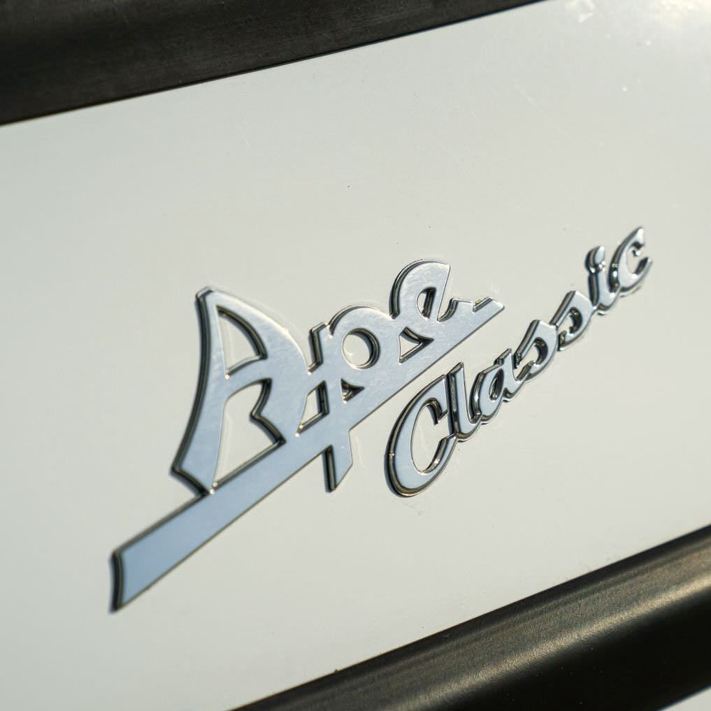
Ape
https://lukedorny.com/updates/ape
#blog #design #classic #wierdcarmastodon #piaggio #vespa #ape #foodTruck #Chromeography
✨ XPUB online open day ✨
Join us during one of the two sessions:
- morning session: 10:00 CET
- afternoon session: 17:00 CET
https://pad.xpub.nl/p/openday
📝🖥️💥🐱📓🌐🍃📠
#education #media #publishing #design #art #rotterdam
ps. If you want visit the XPUB studio and meet us in person, you can join us at the open day on Saturday (15 February) between 10:00-15:00 📆🌠
ps ps. https://xpub.nl/2025/call/
Will have to work on a full redesign to match soon!
https://communitychangemenu.wordpress.com/
#blog #aesthetic #community #anarchist #socialist #leftist #design #painting #activism
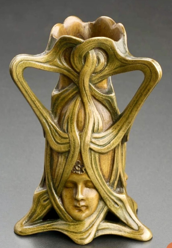
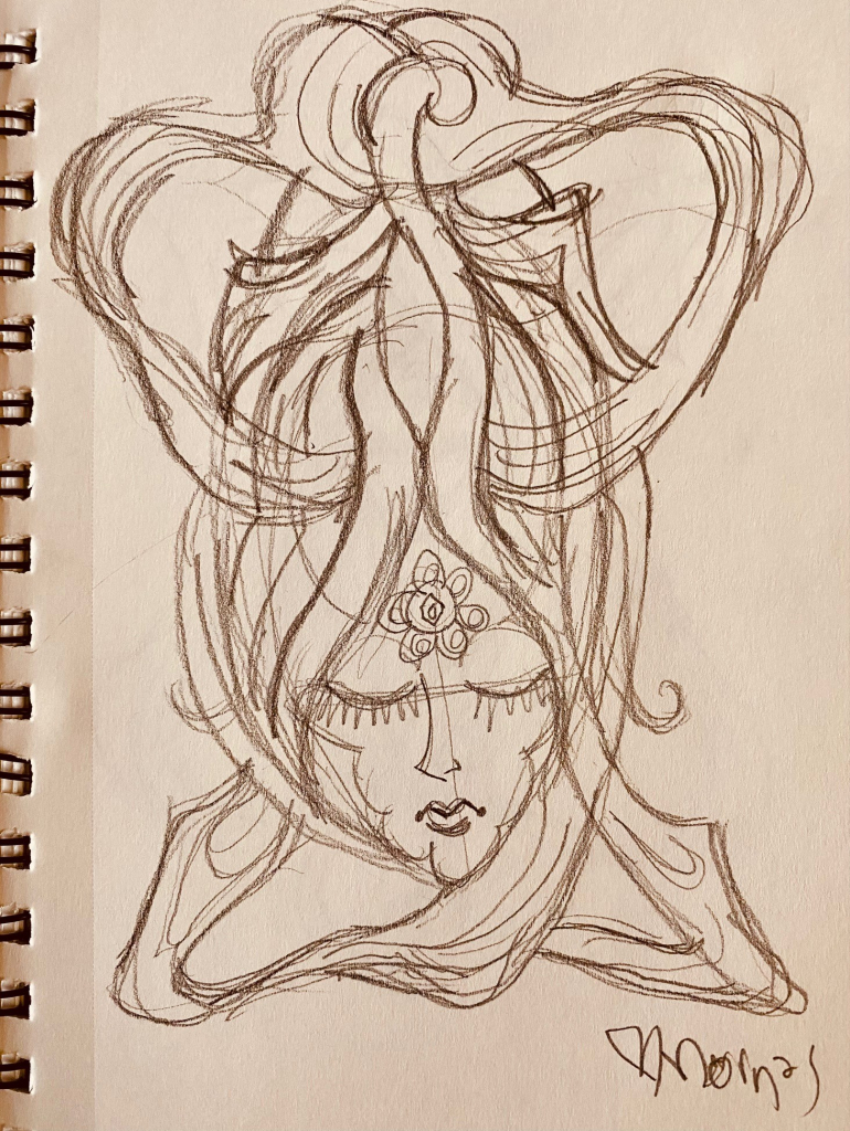
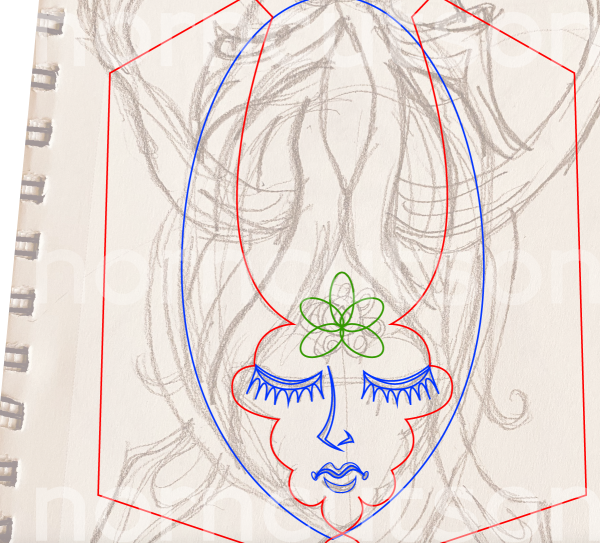
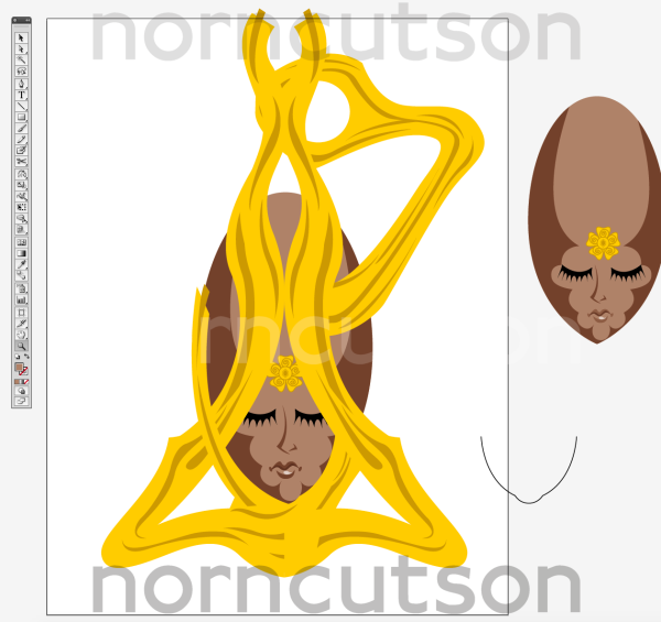
#WorkInProgress #WIP #Illustration #Illustrator #Design #NornCutson #ArtNouveau #MastoArt #Creative
